
I have never bought into the notion of Barry Sheehy and Albert Barbusci as port “developers.” I remain sternly old school in these matters, insisting that to be considered a port developer you must, at least once in your career, have developed a port.
But I’ve also been doubtful about their status as port “marketers,” which is how they billed themselves when this crazy trip began.
It’s not just that they formed their “company” (Harbor Port Development Partners) a month before being granted exclusive rights to market our port for two years (although that’s part of it). Nor is it just their long, strange business trajectory from medical conference organizing to online Mahjong marketing to Chinese cemetery developing. No, it’s also something about the way they present themselves online — because in 2016, how you present yourself online is a big part of “marketing.”
Barbusci has been working on his digital footprint lately, pulling the plug on a number of his half-written bios and vestigial websites (although a few remain, like this one, and this one and — my personal favorite — this one, a blog with two entries, one dated 27 December 2013 about Santa Maria Assunta Church in Positano Italy and a second, dated 7 January 2014, about copper smelting. Actually, maybe he hasn’t been doing that much housekeeping after all.)
Sheehy’s online presence is more concentrated but no less strange: www.barrysheehy.com looks like it was designed in a prison workshop about 15 minutes after the internet was invented.
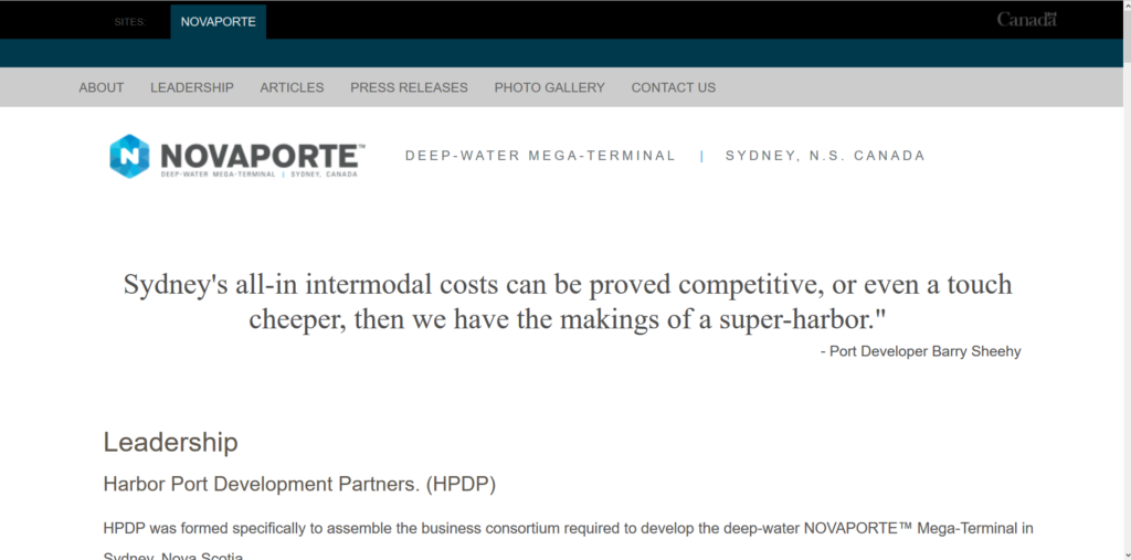
But when it comes to their Harbor Port Development Partners website — or should I say, their “Novaporte” website, for that is the unfortunate name they have given our poor little port that never did anything to either of them — they’ve really outdone themselves. And for once, I’m not even talking about their stated (and decidedly value-neutral) goal of “making transportation history.”
No, I am talking about this:

“Faster and cheeper.”
But “Oh,” you say, because you’re a kind person, “anyone could make that mistake.” Okay, sure, maybe. But could they make that mistake TWICE?
The Best Part
But those are not even the most egregious elements of this design. Have another look and see if you notice anything (I’ve drawn a big red arrow pointing toward it to help you):

Wait, that’s still kind of small. Let me blow that up for you and invert the colors so you can see it better:

Yes, that would be what I have just found out is the “wordmark” of the Government of Canada, tucked discretely into the upper right hand corner of a private company’s website. Why, you ask? Well, I asked too. I asked Canada’s Treasury Board Secretariat, which is responsible for wordmarks and such, and they looked into it for me and sent me this response on Tuesday:
The consistent use of the Canada wordmark ensures that contributions of the Government of Canada are identified clearly to the public. Given that this company does not have a partnership agreement with the government, the Treasury Board Secretariat has requested that they remove the Canada wordmark from its website.
And when I checked, earlier today, it had indeed been removed (these screen captures are from September 14). Still, I wonder how many people saw it before it disappeared and assumed HPDP was working in partnership with the Canadian government?
And I wonder what kind of “marketers” think nothing of slapping the symbol of the Government of Canada on their website, just for the hell of it? (The same kind of marketers who spell “cheap” C-H-E-E-P, apparently.)
This has got to be embarrassing for the mayor and council that hired them. Although, I gotta say, it’s great fun for those of us in the — wait for it — cheep seats.
Featured image: Norwegian Majesty in Sydney Harbor. Photo by freshfighter9 [Public domain], via Wikimedia Commons
The Cape Breton Spectator is entirely reader supported, consider subscribing today!


